Pacotes
library(tidyverse)  # manipulação de dados
library(metan)
library(ggradar)    # gráfico de radar
library(rio)        # importação/exportação de dados

# gerar tabelas html
print_tbl <- function(table, digits = 3, n = NULL, ...){
  if(!missing(n)){
    knitr::kable(head(table, n = n), booktabs = TRUE, digits = digits, ...)
  } else{
  knitr::kable(table, booktabs = TRUE, digits = digits, ...)
  }
}
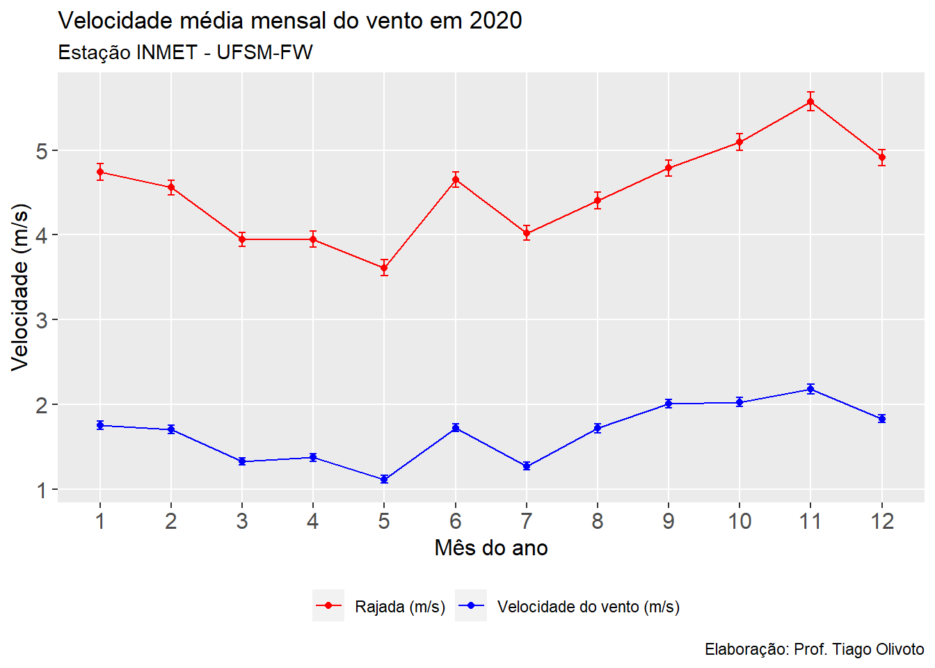
Velocidade média do vento
clima <- import("https://bit.ly/inmet_fred_2020")


clima_long <-
clima %>%
  select(MES, VEL_VE, RAJ_VE) %>%
  pivot_longer(-MES)

print_tbl(clima_long, n = 20)
| MES |
name |
value |
| 1 |
VEL_VE |
0.0 |
| 1 |
RAJ_VE |
2.2 |
| 1 |
VEL_VE |
0.0 |
| 1 |
RAJ_VE |
0.5 |
| 1 |
VEL_VE |
0.0 |
| 1 |
RAJ_VE |
0.0 |
| 1 |
VEL_VE |
0.0 |
| 1 |
RAJ_VE |
0.0 |
| 1 |
VEL_VE |
0.0 |
| 1 |
RAJ_VE |
0.0 |
| 1 |
VEL_VE |
0.1 |
| 1 |
RAJ_VE |
0.8 |
| 1 |
VEL_VE |
0.5 |
| 1 |
RAJ_VE |
1.1 |
| 1 |
VEL_VE |
0.3 |
| 1 |
RAJ_VE |
1.8 |
| 1 |
VEL_VE |
1.5 |
| 1 |
RAJ_VE |
2.7 |
| 1 |
VEL_VE |
1.5 |
| 1 |
RAJ_VE |
3.7 |
# confeccionar gráfico
ggplot(clima_long, aes(factor(MES), value, color = name, group = name )) +
  stat_summary(geom = "point",
               fun = mean) +
  stat_summary(geom = "line") +
  stat_summary(geom = "errorbar", width = 0.1) +
  scale_color_manual(values = c("red", "blue"),
                       labels = c("Rajada (m/s)",
                                  "Velocidade do vento (m/s)"),
                       guide = "legend") +
  theme(panel.grid.minor = element_blank(),
        legend.position = "bottom",
        legend.title = element_blank(),
        axis.title = element_text(size = 12),
        axis.text = element_text(size = 12)) +
  labs(title = "Velocidade média mensal do vento em 2020",
       subtitle = "Estação INMET - UFSM-FW",
       caption = "Elaboração: Prof. Tiago Olivoto",
       x = "Mês do ano",
       y = "Velocidade (m/s)")
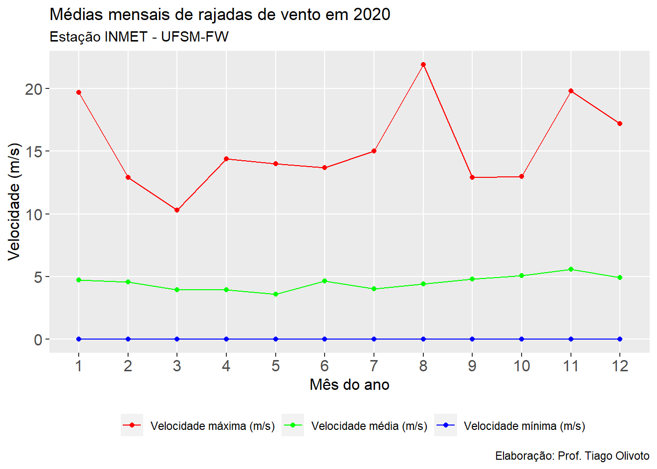
Velocidades máximas e mínimas - rajada
vento_max_min <-
  clima %>%
  group_by(MES) %>%
  summarise(max = max(RAJ_VE, na.rm = TRUE),
            mean = mean(RAJ_VE, na.rm = TRUE),
            min = min(RAJ_VE, na.rm = TRUE)) %>%
  select(MES, max, min, mean) %>%
  pivot_longer(-MES)

print_tbl(vento_max_min, n = 20)
| MES |
name |
value |
| 1 |
max |
19.700 |
| 1 |
min |
0.000 |
| 1 |
mean |
4.743 |
| 2 |
max |
12.900 |
| 2 |
min |
0.000 |
| 2 |
mean |
4.561 |
| 3 |
max |
10.300 |
| 3 |
min |
0.000 |
| 3 |
mean |
3.944 |
| 4 |
max |
14.400 |
| 4 |
min |
0.000 |
| 4 |
mean |
3.948 |
| 5 |
max |
14.000 |
| 5 |
min |
0.000 |
| 5 |
mean |
3.612 |
| 6 |
max |
13.700 |
| 6 |
min |
0.000 |
| 6 |
mean |
4.649 |
| 7 |
max |
15.000 |
| 7 |
min |
0.000 |
ggplot(vento_max_min, aes(factor(MES), value, color = name, group = name )) +
  geom_point() +
  geom_line() +
  scale_color_manual(values = c("red", "green", "blue"),
                     labels = c("Velocidade máxima (m/s)",
                                "Velocidade média (m/s)",
                                "Velocidade mínima (m/s)"),
                     guide = "legend") +
  theme(panel.grid.minor = element_blank(),
        legend.position = "bottom",
        legend.title = element_blank(),
        axis.title = element_text(size = 12),
        axis.text = element_text(size = 12)) +
  labs(title = "Médias mensais de rajadas de vento em 2020",
       subtitle = "Estação INMET - UFSM-FW",
       caption = "Elaboração: Prof. Tiago Olivoto",
       x = "Mês do ano",
       y = "Velocidade (m/s)")
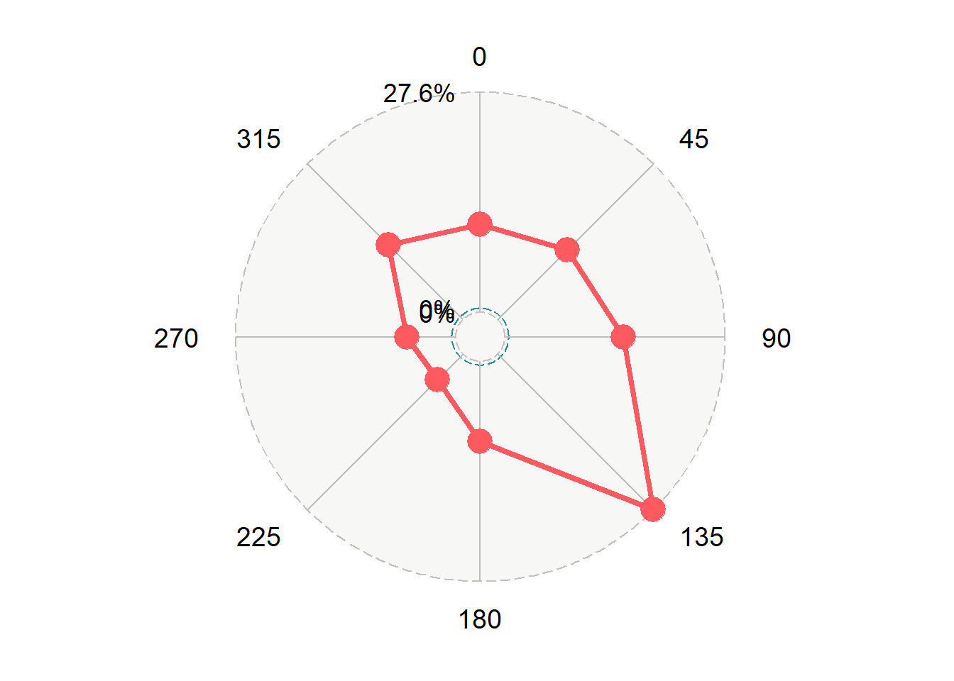
Direção do vento
freq <-
  cut(clima$DIR_VE, breaks = seq(0, 360, by = 45)) %>%
  table() %>%
  as.data.frame() %>%
  set_names("Direção", "Dias") %>%
  mutate(Direção = paste0(seq(0, 315, by = 45)),
         Percent = Dias / 8784 * 100) %>%
  remove_cols(Dias)

print_tbl(freq)
| Direção |
Percent |
| 0 |
10.997 |
| 45 |
12.341 |
| 90 |
14.857 |
| 135 |
27.607 |
| 180 |
10.041 |
| 225 |
4.542 |
| 270 |
6.125 |
| 315 |
13.286 |
# criar um radar plot para mostrar a direção predominante
# do vento
ggradar(freq %>% transpose_df(),
        values.radar = c("0%", "0%", "27.6%"),
        grid.max = max(freq$Percent))