Temperatura no ponto de orvalho
Pacotes
library(tidyverse)  # manipulação de dados
library(metan)      # manipulação de dados
library(rio)        # importação/exportação de dados

clima_fred <- import("https://bit.ly/inmet_fred_2020")
clima_pf <- import("https://bit.ly/inmet_pf_2020")
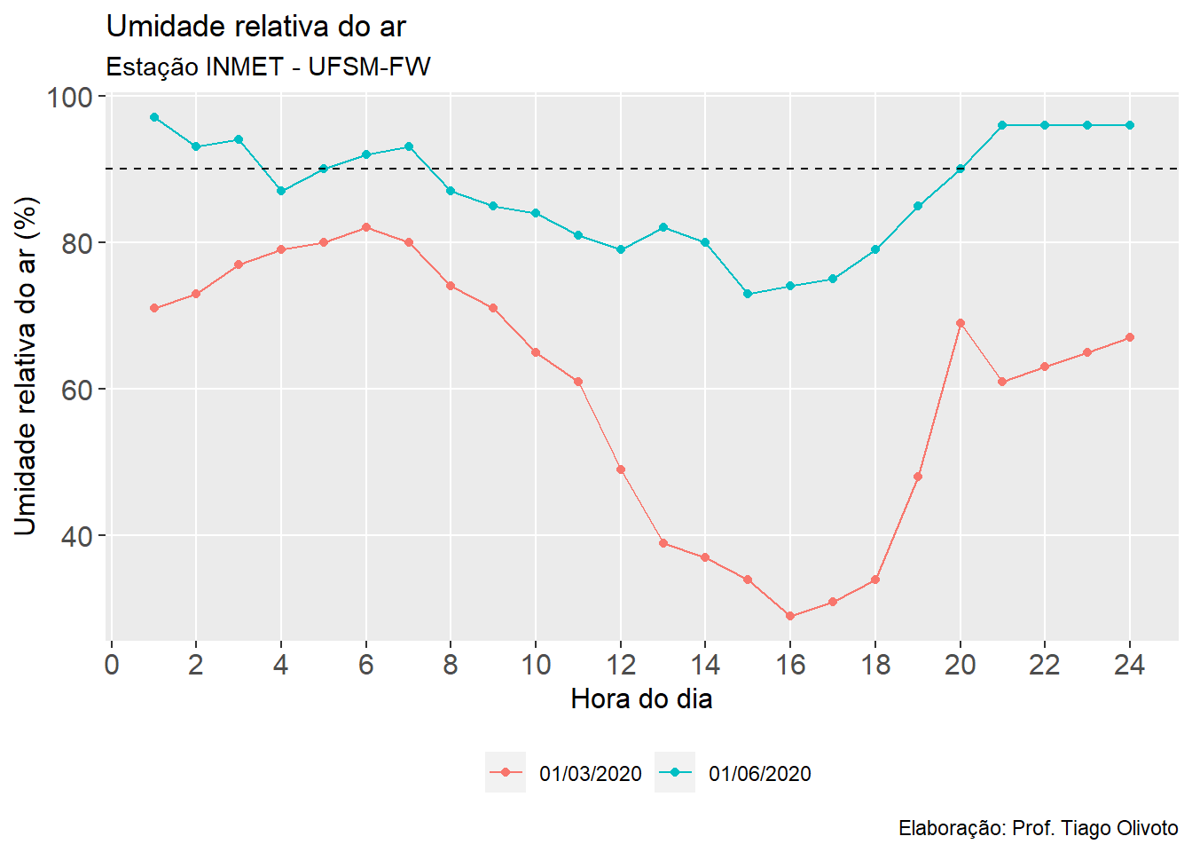
Período de molhamento foliar
df_horas <-
  subset(clima_fred, DATA %in% c("01/03/2020",
                                 "01/06/2020")) %>%
  select(DATA, HORA,  UM_INST)

ggplot(df_horas, aes(HORA, UM_INST, color = factor(DATA), group = DATA)) +
  geom_line() +
  geom_point() +
  geom_hline(yintercept = 90, linetype = 2) +
  theme(panel.grid.minor = element_blank(),
        legend.position = "bottom",
        legend.title = element_blank(),
        axis.title = element_text(size = 12),
        axis.text = element_text(size = 12)) +
  scale_x_continuous(breaks = seq(0,24, by = 2)) +
  labs(title = "Umidade relativa do ar",
       subtitle = "Estação INMET - UFSM-FW",
       caption = "Elaboração: Prof. Tiago Olivoto",
       x = "Hora do dia",
       y = "Umidade relativa do ar (%)")
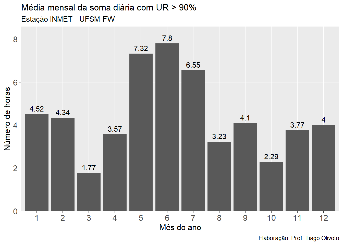
Média mensal da soma diária de horas com UR > 90%
# número de horas com UR > 90%
df_horas2 <-
clima_fred %>%
  select(DATA, HORA, MES, UM_INST) %>%
  mutate(NHUR = ifelse(UM_INST > 90, 1, 0)) %>%
  sum_by(DATA, MES) %>%
  select(DATA, MES, NHUR)
## Warning: NA values removed to compute the function. Use 'na.rm = TRUE' to
## suppress this warning.
## To remove rows with NA use `remove_rows_na()'.
## To remove columns with NA use `remove_cols_na()'.
knitr::kable(head(df_horas2, n = 12), booktabs = TRUE)
| DATA | MES | NHUR |
|---|---|---|
| 01/01/2020 | 1 | 10 |
| 01/02/2020 | 2 | 7 |
| 01/03/2020 | 3 | 0 |
| 01/04/2020 | 4 | 0 |
| 01/05/2020 | 5 | 5 |
| 01/06/2020 | 6 | 9 |
| 01/07/2020 | 7 | 7 |
| 01/08/2020 | 8 | 0 |
| 01/09/2020 | 9 | 5 |
| 01/10/2020 | 10 | 0 |
| 01/11/2020 | 11 | 3 |
| 01/12/2020 | 12 | 10 |
df_horas2 <- means_by(df_horas2, MES)
knitr::kable(df_horas2, booktabs = TRUE)
| MES | NHUR |
|---|---|
| 1 | 4.516129 |
| 2 | 4.344828 |
| 3 | 1.774193 |
| 4 | 3.566667 |
| 5 | 7.322581 |
| 6 | 7.800000 |
| 7 | 6.548387 |
| 8 | 3.225807 |
| 9 | 4.100000 |
| 10 | 2.290323 |
| 11 | 3.766667 |
| 12 | 4.000000 |
# gráfico
ggplot(df_horas2, aes(factor(MES), NHUR)) +
  geom_col() +
  geom_text(aes(label = round(NHUR, 2)),
            vjust = -0.5) +
  theme(panel.grid.minor = element_blank(),
        legend.position = "bottom",
        legend.title = element_blank(),
        axis.title = element_text(size = 12),
        axis.text = element_text(size = 12)) +
  scale_y_continuous(expand = expansion(c(0, 0.1))) +
  labs(title = "Média mensal da soma diária com UR > 90%",
       subtitle = "Estação INMET - UFSM-FW",
       caption = "Elaboração: Prof. Tiago Olivoto",
       x = "Mês do ano",
       y = "Número de horas")
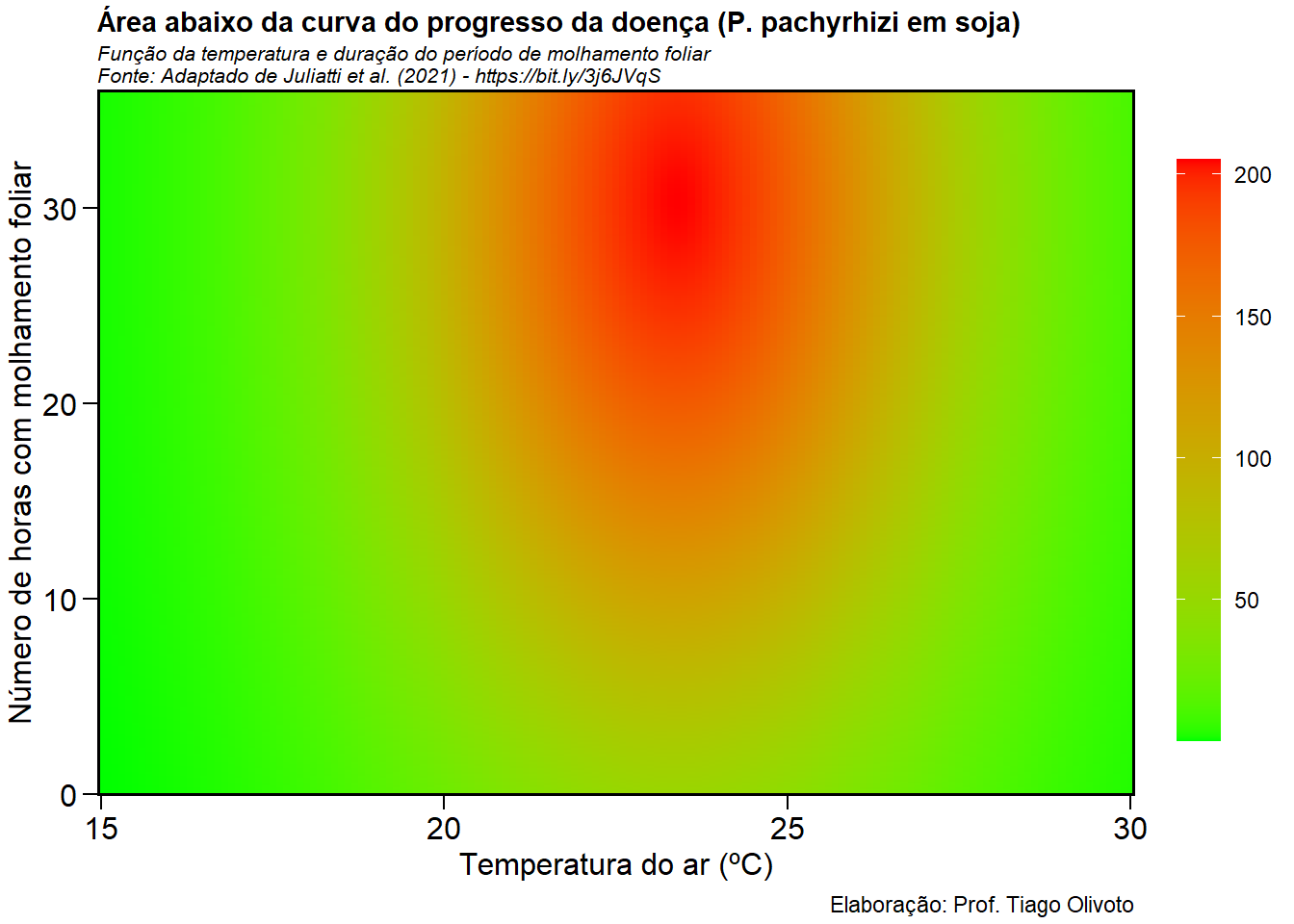
Período de molhamento foliar vs doenças de plantas
O gráfico desta seção apresenta a área abaixo da curva do progresso da doença (AACPD) em função da temperatura do ar e período de molhamento foliar.
Referência: JULIATTI, B. C. M.; POZZA, E. A.; JULIATTI, F. C. Severity of rust infection in soybean genotypes with partial resistance as a function of temperature and leaf wetness duration. Genetics and Molecular Research, 2021. v. 20, n. 2, p. gmr18781.
Veja como
quantificar a área foliar doente usando imagens de folhas no pacote pliman.
# modelo AACPD
# x = temperatura (ºC)
# y = molhamento foliar (h)
get_audpc <- function(x, y){
  204.95 * exp(-0.5 * ((( x - 23.39) / 2.74)^2 + (( y - 30.35) / 18.44)^2))
}

temp <- seq(15, 30, by = 0.1)
mol <- seq(0, 36, by = 0.1)
df <-
  expand_grid(temp, mol) %>%
  mutate(audpc = get_audpc(temp, mol))

# criando o gráfico
ggplot(df, aes(temp, mol, z = audpc, fill = audpc)) +
  geom_tile() +
  scale_fill_gradient(low = "green", high = "red") +
  scale_x_continuous(expand = c(0, 0)) +
  scale_y_continuous(expand = c(0, 0)) +
  guides(fill = guide_colourbar(barheight = unit(8, "cm"),
                                title = element_blank())) +
  labs(title = "Área abaixo da curva do progresso da doença (P. pachyrhizi em soja)",
       subtitle = "Função da temperatura e duração do período de molhamento foliar\nFonte: Adaptado de Juliatti et al. (2021) - https://bit.ly/3j6JVqS",
       caption = "Elaboração: Prof. Tiago Olivoto",
       x = "Temperatura do ar (ºC)",
       y = "Número de horas com molhamento foliar") +
  theme_metan() +
  theme(legend.position = "right")
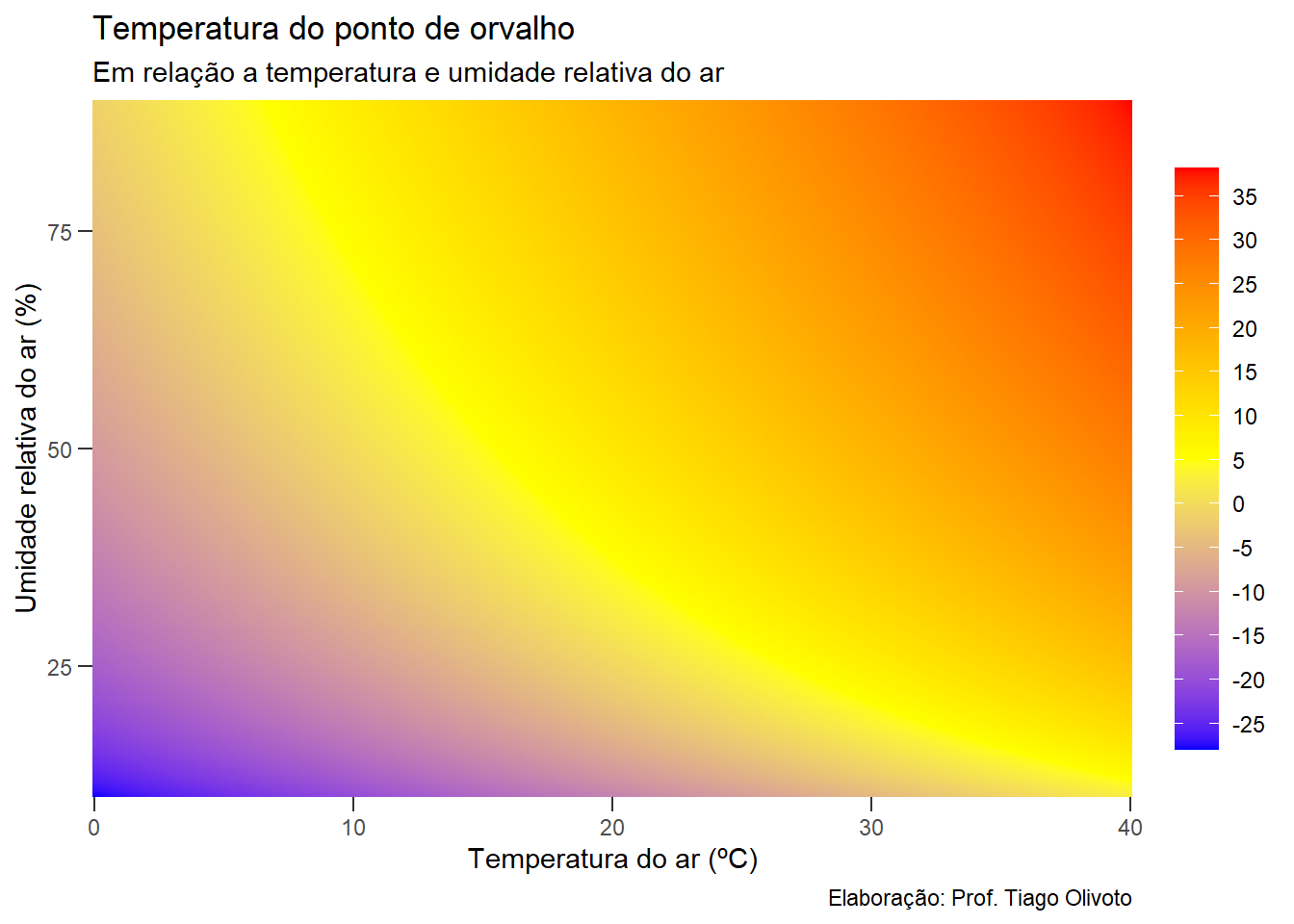
Temperatura no ponto de orvalho
A temperatura no ponto de orvalho (T\(o\)) considerando a temperatura do ar (t) e umidade relativa (ur) pode ser aproximada pela seguinte equação (https://pt.planetcalc.com/248/)
$$ T_{o}=\frac{b\left(\frac{a T}{b+t}+\ln ur \right)}{a-\left(\frac{a T}{b+t}+\ln ur\right)} $$ Onde a = 17.27, b = 237.7, ln: logaritmo natural, \(ur\): umidade relativa do ar (de 0 a 1),
# fórmula disponível
get_tpo <- function(t, ur){
  a <- 17.27
  b <- 237.7
  ur <- ur / 100
  (b * ((a * t) / (b + t) + log(ur))) / (a - ((a * t) / (b + t) + log(ur)))
}

# ponto de orvalho
# umidade: 75 %
# temperatura: 15º
get_tpo(15, 75)
## [1] 10.60278
# criar dados
temp <- seq(0, 40, by = 0.1)
ur <- seq(10, 90, by = 0.1)
df <- expand_grid(temp, ur)
df <- mutate(df, po = get_tpo(temp, ur))

# criar um gráfico
ggplot(df, aes(temp, ur)) +
  geom_tile(aes(fill = po)) +
  scale_fill_gradientn(colors = c("blue", "yellow", "red"),
                       breaks = seq(-35, 35, by = 5)) +
  theme(axis.ticks.length = unit(0.2, "cm")) +
  scale_x_continuous(expand = c(0, 0)) +
  scale_y_continuous(expand = c(0, 0)) +
  guides(fill = guide_colourbar(barheight = unit(8, "cm"),
                                title = element_blank())) +
  labs(title = "Temperatura do ponto de orvalho",
       subtitle = "Em relação a temperatura e umidade relativa do ar",
       caption = "Elaboração: Prof. Tiago Olivoto",
       x = "Temperatura do ar (ºC)",
       y = "Umidade relativa do ar (%)")